*Critique Club*
Good one.
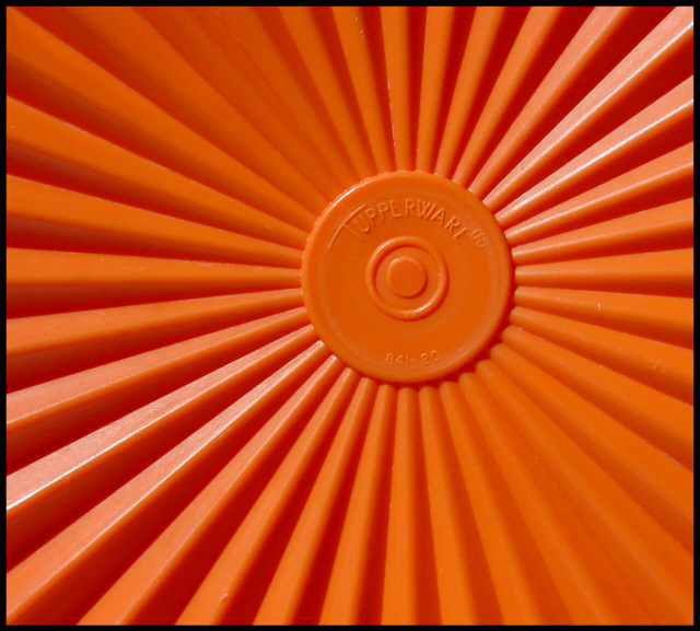
I like the depth in this. While it isn't hugely deep, what depth it does have is really strong. The lines are really nice and defined.
Most of them anyway. I see that the lines which go off into the upper right, and lower left, are not repeated in the upper left and lower right. See what I mean? Those 2 corners kind of just blend in and don't have the lines that create the detph in the rest of the shot.
I do like where you have positioned the center circle of the tupperware. It's off center enough to be 'dramatic' and not look like an error, yet in the frame enough to still show the upper right portion of the object.
Focus and clarity are good. The logo is easily recognisable and easily readable.
The color is excellent and difinately fits into the challenge. It is a nice, brightly colored orange, with a nice pattern to it.
I really can't see anything that I would like to see differenly other than maybe some extra detail in the U/L and L/R corners.
What a fun shot.
~Heather~
I really like this - it reminds me of the sun motifs which were common on front doors - I think in the 1930s or 1940s. I remember studying them at school - briefly, as part of some other subject. The tupperware registered trademark ties in with that era too. The colour is wonderful and I love the dark and light shadows. I'd like to crop this a little so that the "sun" was positioned on a vertical and horizonal thirds intersection point.
I like your subject, that you chose to photograph something that we see all the time but never really notice. Gives it more importance the way you've cropped it.






 Add photograph to your favorites
 Add photographer to your favorites


