Author Thread Comments Made During the Challenge
Post actions
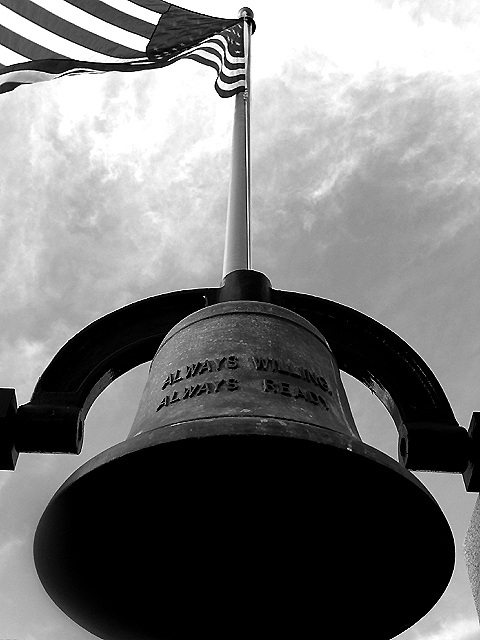
nice framing, it's almost perfect -- i'd like to see the bottom of the bell tho.
Post actions
I like the symmetry of thie photo. I would like to be ablle to read te words more clearly on the bell.
Post actions
Post actions
A reall killer to expose correctly. I'd have gone under just a bit more to keep the sky from blowing out quite so much, then used a positive gamma adjustment to retrieve the shadow detail. The flagpole emerging from the bell is a little weird - might work better if you'd gotten it perfectly centered on the round bit of the bell's yoke and avoided the bit of the column at R.
Post actions
Nice pic. I like the clouds and the angle.
Post actions
Very nice, but what are the words after ALWAYS? Nit time: crop the cement lower right hand corner, and could the flag pole have been centered more with the top of the bell holder? (It's just a bit left of center, picky, picky, picky, yes, yes) Photo 9 Creativity 7 B&W 8 total 8
Post actions
interesting subject, well exposed
Post actions
Cool sky and nice shadows
Post actions
Post actions
This might have some patriotic/symbolic significance I don't get because I'm not American, but it's a nice photo, if a bit starkly framed.
Post actions
Great use of Black and White (dynamic tone), but I would like to see inside the bell.
Post actions
Nice b&w usage. The flagpole cuts this right up the middle though. Seems a little dark in places also.
Post actions
The thing on the lower right is distacting.
Post actions
I like, but wish something would have made it into the shot completely. good job.
Post actions
I like the concept and the contrast on this photo quite a bit but the tilt to the right is a little bit strange... :)
Post actions
Good color contrast, I'm not sure I care for the angle. But that's just me.
Post actions
Nice shot. Just would have made it easier to read the bell; it was a little difficult to see "willing" (i think that's what it says).
Post actions
Parts look a little over-sharpened to me...sometimes hard to predict how much the final JPEG compression will affect that.
Post actions
Post actions
Nice shot. The perspective makes it work.
Post actions
I guess I would suggest either -o-r here. The bell or the flag. Creative idea and a good try. Nice job.
Post actions
The clouds against the flag are distracting. Otherwise great idea here.
Post actions
good catch. good contrast.
Post actions
Needs more detail on the front of the bell to really work - a reflector would have lifted the shadow just enough.
Post actions
WHAT A BELL. Wow, it's huge!! Great capture.





 Add photograph to your favorites
 Add photographer to your favorites


