*Critique Club*
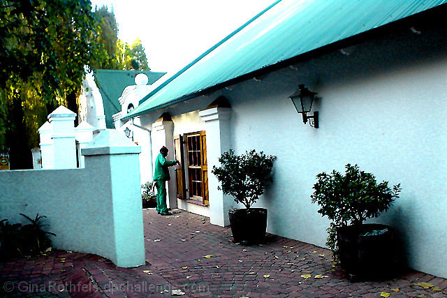
Secondary colors are created by mixing EQUAL amounts of 2 primary colors. By this definition, the only color that is close to meeting the challenge is the green tree in the background. The rest appears to be more of a blue/green, which would not be a secondary color.
(darn those picky people)
I am also not diggin the left tilt of the photo. It's not enough to be dramatic, but enough to be noticed, which makes it look like an error rather than something that was done for a reason.
The focus and clarity are also strange. I'm not really sure what's going on with that green tree in the background. It looks really pixeled, when the rest of the shot is, for the most part, ok.
It is hard to tell if the white area is sky, or if it maybe another wall from a building in the back?? I do think it is sky though, and I do also think that it's way too bright. See what it's doing to the roof?
I think it's a pretty scene, worth trying again for outside the challenge. I like the pillars, and the round ball on the top of the building. I think it makes for a nice composition.
Try it on a day that is not quite so blinding though.
~Heather~
some of the highlights are blown, causing loss of detail in the building, and the hue shift is causing some of the elements to look very unnatural. Also seems there is some strange compression sort of thing happening to the trees in the background left.
The color in this photo is quite interesting, but the exposure and sharpness of the image seems quite a bit weak... It looks possibly like jpeg artifacting but I can't really tell... the perspective you chose is excellent... = 5
the rotation seems a bit off, but the larger issue is that the way the light falls its hard to discern the green color of the clothing and i have no idea what color the roof is, the plants and most of the trees aren't showing much green either (unless of course you are indicating that this is an energy efficient house and therefore 'green')







 Add photograph to your favorites
 Add photographer to your favorites

 Photographer found comment helpful.


