Author Thread Comments Made During the Challenge
Post actions
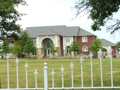
Oh my gosh. My two million dollar mansion has tilted to one side and is sliding down a hill!
Post actions
IMHO...The gate in the foreground is very distracting and the tree on the left detracts from the house. The background seems washed out. Maybe a shot inside the fence (if that's even possible) at more of an angle when the lighting is not so harsh would help.
Post actions
Good subject and composition, but you need to level it. Note how the fence is higher on the righthand side of the picture than the left.
Post actions
horizon is not level, sky is blown out, focus too soft
Post actions
i dislike the rotation/tilt of the photo. the building could use a sharper focus too.
Post actions
I would like this pic better if it was lined up to be horizontal
Post actions
Neat house. Trees are a little distracting and the image is a little small.
Post actions
My room is the 17th window on the right. :)
Post actions
The railings are distracting, and the sloping horizon really detract from this image, a little more contrast would also help.







 Add photograph to your favorites
 Add photographer to your favorites


