| Author | Thread |
|
|
05/22/2003 09:09:00 PM |
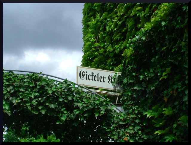
Not knowing German, I don't know what the sign says. However, that doesn't matter since the curves and angles and colors speak for themselves. You've done a remarkable job of capturing detail within the sky while holding detail in the foilage ... quite an accomplishment, I think. The composition is quite nice although I might have tried to avoid the vertical line (and thus the sign, too) being right in the middle of the picture (kind of like not putting the horizon right in the middle) but you're the artist and it still "works". I also like the mixture of curve and angle which you've portrayed here. The statement for this challenge was, "Mix any two primary colors, and you'll get a secondary color -- purple, orange, or green. ..." The beautiful greens which you've shown us certainly meets the challenge.
I think the biggest "lack" in this photograph is the lack of a "focal point" or point of interest. Other than the color "green", I don't see why you aimmed your camera in this direction. Having such a focal point might have created a "wow" factor which, in my opinion, would have gotten you a better rating from the participants here.
Still, a very well executed image. Thanks for submitting it and sharing it with us.
Regards ... for the Critique Club,
Bob Mahan
(rmahan)
|
|
Comments Made During the Challenge  |
|
|
05/20/2003 07:19:09 PM |
|
 Photographer found comment helpful. Photographer found comment helpful. |
|
|
05/16/2003 03:01:53 PM |
The green in this photo makes it meet the challenge but the primary focus of the picture for me is the sign. I like how the curved bar leads my eye into the picture to the sign so I think you have made good use of lines here. I would drop the black border or at least go with a white one. The picture is a tad on the dark side (very slightly) and I think the black border might be causing me to see it that way. A white border might lighten things up a little. Unfortunately for me there isn’t a lot to look at here. This is not a picture that holds my attention, though it is technically good. Maybe if there were something going on in the foreground it would do more for me. I gave it a 4.
Greg
|
|
| Photographer found comment helpful. |
|
|
05/16/2003 12:57:31 PM |
|
this is a good image, nice and clear, colors are sharp as well |
|
| Photographer found comment helpful. |
|
|
05/15/2003 05:23:20 PM |
|
The scenery looks beautiful, but I think the photo looks a little under-exposed. |
|
| Photographer found comment helpful. |
|
|
05/15/2003 08:30:47 AM |
|
Choice! That stormy sky out the back is fantastic - 9. |
|
| Photographer found comment helpful. |
|
|
05/15/2003 12:21:45 AM |
|
This shot doesn't really say a lot, try to choose your subject matter better |
|
| Photographer found comment helpful. |
|
|
05/14/2003 01:40:12 PM |
|
this photo simply lacks something interesting to look at... = 4 |
|
| Photographer found comment helpful. |
|
|
05/14/2003 12:58:40 AM |
|
Looks a little like a snapshot to me. 4 |
|
Theme:
Classic /
Light /
Dark
Home -
Challenges -
Community -
League -
Photos -
Cameras -
Lenses -
Learn -
Help -
Terms of Use -
Privacy -
Top ^
DPChallenge, and website content and design, Copyright © 2001-2026 Challenging Technologies, LLC.
All digital photo copyrights belong to the photographers and may not be used without permission.
Current Server Time: 10/12/2026 07:11:41 PM EDT.





 Add photograph to your favorites
 Add photographer to your favorites


