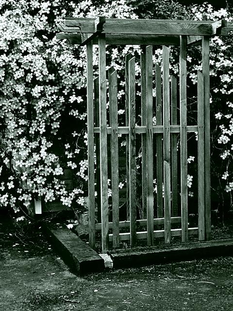
this looks like it was done in duotone-- i found that if you go by gordon's tutorial *but* lighten the green a few shades, it makes a more pleasing B&W. But I do like the stark contrasts you have here!
This seems to have a slight green tinge to it. Is it just my monitor? Good composition, used of ROT. Something a little more to hold my interest would've been nice.
Interesting shot.. I'm not sure if it's me or the image but I beleive there is a green tint to this photo... I have looked at it on two different systems with the same results... anyway... The composition is nice but i'm not quite impressed with the subject... it's a little 'busy'...







 Add photograph to your favorites
 Add photographer to your favorites


