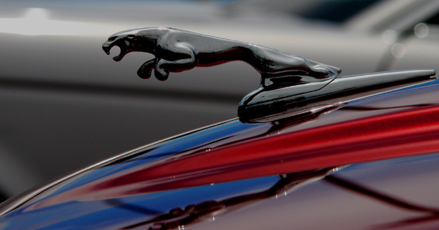
It's a beautiful shot - no argument there. You have plenty of comments to back that up. Personally, I scored this shot a 7. I think it showed a tremendous amount of promise, but could have perhaps brought it all together a little more concisely. The blue and red overtones create a very dramatic effect, but I'm not sure what they really add to the overall image. Sure, blue, red, silver/black/white are all very bold and appealing tones, but why did you choose those two particular ones? Jaguar used to be a British car (now owned by Ford), so I'm not sure if you were trying to suggest nostalgia or patriotism, or if it was simply the two colors that first came to mind when processing this image. Any of the possibilities seem plausible to me, given the final product.
I dont' say this to be cruel or insensitive. Trust me, I appreciate the sacrifices United States citizens (and for that matter any other nation's citizens) make every day, but it begs the question "why those colors?" Certainly, they make a dramatic statement, but I don't see the relevance in this particular image. I know I've gone about this the long way around, but I'm just trying to convey my thought process.
Don't get me wrong - I did score this a 7 (which is pretty darn good I think on this site with world-class photographers). Perhaps there is no real reason for selecting those particular tones to augment, but it does lead me to ponder the question. Regardless, I think this is a very strong entry and image on its own merit.
Great framing of the ornament - the curve of the hood and the blur of the background really gives energy to the shot. I think would have really liked this better in b/w, though, because the red of the hood in front is jarring.
interesting desat. for me it pulls my interest away from the main subject, the red is just begging to be looked at. Love the tones in the desat section too.
ooo- lol. see, thats why i didn't take the picture of my uncle's Mercedes-Benz symbol. i knew, or at least i was hoping the jag would come out~! please tell me its yours, lol, but i see an other in the background, lol, what dealership? great job~! i really love it~!
I like the Idea... it has something creative just to see it. the blue and red colors of the car make the photo from good to very good!!!
the fact that the puma is shining add to this as well.
if i may add.. about the composition.. the relected puma head is cut.. and you can actually see the background which is a car.. so maybe there was another angle.
top left shining is excelent as it seems it went out from the puma head and the black line.. is in the right compose i think..






 Add photograph to your favorites
 Add photographer to your favorites


 Photographer found comment helpful.


