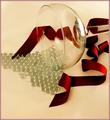
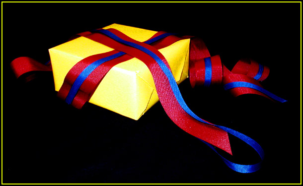
Nice shot. I like the composition here. The lighting is too harsh though. It is reflecting too brightly on the front yellow portion of the box. The red ribbons in the back are a little dark. I also see some blue in the black front portion. Can't understand what that is.
Nice simple shot - great saturation in the reds and blues. Lighting doesn't feel quite right - the yellow is bouncing quite a lot of it off which means the yellow seems paler whereas the red ribbon is in the shadow in some areas.
Great composition.
I like the simple concept of this shot. I do feel that a tighter crop and the light being angled differently or bounced off a near by object would help with the hot spot on the package. The ribbon is a nice touch and adds a human touch to it. The package being turned so that the folded side is less visible would also put a more polished feel to it. 7 -danny
I really love the composition of this shot - it's like...unfinished business. The colors are all 3 present, striking and honestly with the exception of a slightly blown out corner - well exposed. Excellent shot. 10
nice setup and choice of subject. lighting looks a bit strange with the box seeming very bright but the ribbons seeming a little dark, esp. on top, but that's just a nit, overall i like it very much.





 Add photograph to your favorites
 Add photographer to your favorites

 Photographer found comment helpful.


