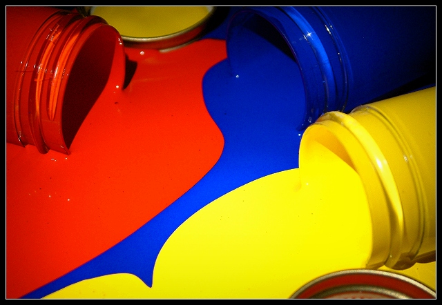
This is very nice. I like how you have balanced it by putting the red top on the bottom near the yellow, and the yellow top near the red at the top of the photo. I think my favorite part is where the blue goes down into a point into the yellow near the bottom of the photo. The focus and clarity appears to be really nice, and the angle and framing/cropping are nice as well. Good shot! ~Heather~
I like that this shot is like chaos, but each colour has it own distinct edges, without any blending into the other colours. Those lines really make this shot pop for me. There lis a little big of compression or something jaggies along the yellow pain near the bottle and I would have liked it if the yellow bottle itself were in focus too, perhaps a great DOF to capture it all? :) Great composition.
Oh, I bet this was messy! I really like your take on the challenge by using the spilled jars of paint. Although the blue is not represented as much as the yellow and red, the pattern it left is very effective. I might have left the lids out of the picture. They don't really add anything positive to the photo. The lighting seems a little uneven, but other than those two things, this is a very nice portrayal of the primary colors. 8 Good luck in the challenge!
This is one of the better paint pics. The lighting is well done to minimize reflections. The yellow seems hot to me, perhaps tuning down the saturation for yellow might lessen that. The composition is cool the way the paints flow together in that pattern. Good pic. 8 -danny
Great, bright, vivid colours and super composition. Really nice. Did the lines between the different colours come about on their own or did you help them?
I bet you had to clean this mess up, didn' t you? Wonderful tones and lighting, though the glare can be distracting at times. I wish the blue had as much strength as the other colors.
Great shot..... certainly a vibrant image... not sure about the lids..... I think it would have been a stronger image without them..... good luck, Todd.





 Add photograph to your favorites
 Add photographer to your favorites


