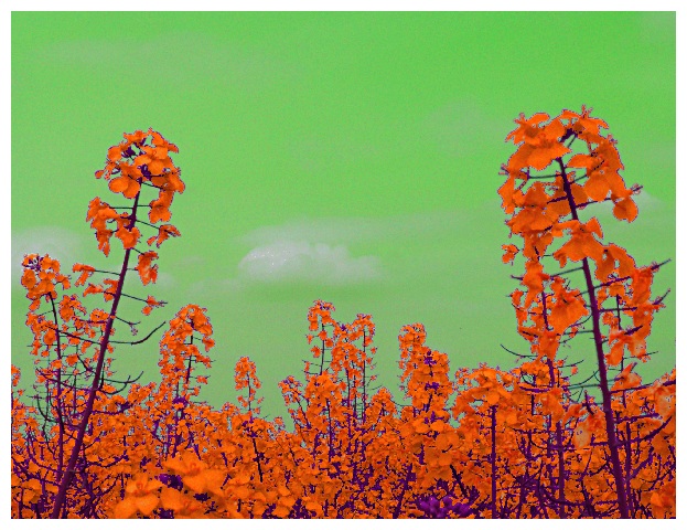
Stephan - I don't like the use of unnatural coloring to meet the challenge. I do like your composition and subject matter. I think that if the challenge is a color challenge, however, that you should endeavor to find the colors naturally. I think digital 'art' doesn't work as well on dpc - and that's what hurt your overall score.
You have done one of my 3 favorite shots on DPC (Edison's Gift) but this shot just doesn't draw us in the same way - it's cold and distant from the viewer - nothing we can relate to.
Hohum... "cool but too digital"... Well, I admit I'm stretching the D in DPC ;-)
Regarding the jaggies: I uploaded a different version here which should have less problems with that.
cpanaioti: It's a hue shift of the colours. I changed each channel differently.
tomzinho: Special thanks for your funny comment :)
very cool - okay frodo, take the ring off . . . now!
unfortunately it seems that the photo quality suffered in transference from that universe to ours, but the picture is striking enough that it still works just fine.
The saturation's been pumped so high, and the color balance tweaked so hard, that the image is nearly incoherent. Less pixelation and better definition/contrast on each individual flower would have gotten a much better vote from me.





 Add photograph to your favorites
 Add photographer to your favorites

 Photographer found comment helpful.


