Critique Club Critique
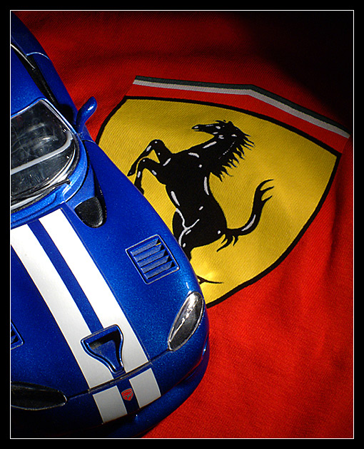
Title: "Racing Colors", by bod
Composition: A well composed shot. The partiality and placement of the objects ties them together
Technical: The lighting is lacking leaving some dark shadows on whet I would consider the main subjects. This also has cast darkness across the red making it untrue. You did accomplish "no glare" on the shiny car, and I suppose that was a trade off for you when you put it together. Your focus is very sharp showing that you have good control of depth of field, giving this shot complete clarity.
Challenge: Your choice of subjects and their color puts you well into the challenge requirements for "Primary Colors".
Suggestions: I think the only problem you had with this were in the lighting, and that the overall results didn't have a lot of WOW factor. Most of the viewers probably didn't get the connection between the Viper and Ferrari, which may account for a lower score. I gave you a 6 on this, as you were only a little off in the mentioned areas and you did give it a jolly good try.
Disclaimer:
Bear in mind that I am here to learn, just as many others and any comments that I have made are not intended to be offensive in any way, and are only constructive criticisms. If you wish to comment or discuss this critique please feel free to do so at any time.
Thank you,
Dick Pattee (Autool)
Autool@attbi.com
|





 Add photograph to your favorites
 Add photographer to your favorites

 Photographer found comment helpful.


