I certiainly didnt get to spend enough time here at this memorial. Most folks drove over to the first planned meeting place, while we took the train, so they had more time. I was just starting to see all the potential shots here and it was time to go. I think next month I will be back there to reshoot the memorial, as it is a spectacular one.
File Name
CRW_1029.CRW
Camera Model Name
Canon EOS DIGITAL REBEL
Shooting Date/Time
7/30/2005 11:04:53 PM
Shooting Mode
Aperture-Priority AE
Tv( Shutter Speed )
8
Av( Aperture Value )
14
Metering Mode
Evaluative
Exposure Compensation
+2/3
ISO Speed
100
Lens
28.0 - 135.0 mm
Focal Length
105.0 mm
Image Size
3072x2048
Image Quality
RAW
Flash
Off
White Balance
Auto
AF Mode
AI Focus AF
Parameters
Contrast +2
Sharpness +2
Color saturation +1
Color tone Normal
Color Space
sRGB
File Size
6182KB
File Number
210-1029
Drive Mode
Continuous shooting
Owner's Name
Camera Body No.
0960335456
Statistics
Place: 31 out of 200 Avg (all users): 6.2176 Avg (commenters): 7.7500 Avg (participants): 6.0971 Avg (non-participants): 6.3088 Views since voting: 1859 Views during voting: 439 Votes: 239 Comments: 20 Favorites: 2 (view)
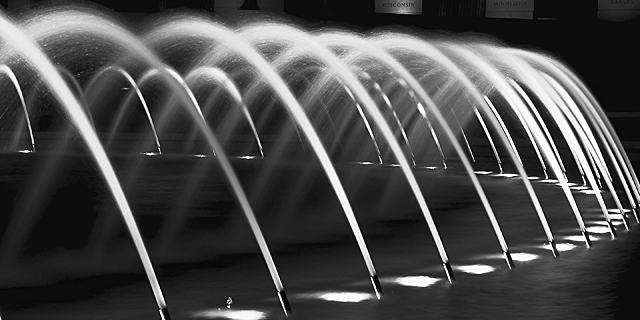
I very much like the shape of this pic. Not sure if the names of the states could have been avoided and my curiosity is intrigued to know what the small object is between the first two spouts lower left.
Only deduction is for the white blotch just above the first light. Since this was an advanced editing challenge I would have preferred to see it cloned out.
Nice repeated elements, though I find the right hand side a little cluttered. As I imagine cropping more and more of the photo from the right, I get to two or three fountains in the forground and the photo begins to feel uncluttered to me. On the other hand I am on the extreme fringe of advocating for simplicity in photo composition at this site.
If this is at University of Texas, I tried my hand with this fountain some years ago and found my own results failed to capture what I experienced being there.
'7' - This is a good concept and has a lot of potential. Criticism (with the caveat I know squat about long exposures); my first thoughts on seeing this was that I would like to have seen the far right 'edge' incorporated. Cropping out of the windows/signs? up middle through top right would make this a better photograph in my opinion. Also, I think a slight nudge rotation to the left to align it better is required. As far as I know this is an advanced editing Challenge, so I would like to see those 'things' in between the first and second fore spouts removed. Seems to be a fraction of gamma trouble with some black areas on the water, but that MAY be my monitor. I think the b/w(?) works well here.
I can see why the crop is how it is, but I would suggest cropping even further- just to the right of the middle poster and then you could crop out the others as well. Also the posters make me realize that the image is not level. I wonder if you could have gotten away with cloning them out without a DQ? Other than the posters a gorgeous image. perhaps you could have shot from higher up? Also there is a distracting element between the first spouts from the left that could have been cloned out... a 6, may bump up later
what the hells that thing inbetween the first on the left and the second water spout??? Very distracting. Other then that its a very nice shot and with that spot edited out and the right frame would lok good on a wall. Well done and good luck in this challenge. <7>
explaining that spot might increase your score, remove this comment. I accept replies during voting for this reason only.





 Add photograph to your favorites
 Add photographer to your favorites

 Photographer found comment helpful.


