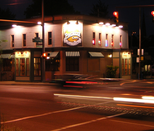
The tope part of the building is a little to blown out/washed out. Perhaps try a -5(-10 or somewhere about there) brightness and +5(+10 or somewhere in there) contrast should make for a nicer photo. It should make the colors pop a little more without blowning out all colors ad giving you color wash. Good luck in this challenge. <5>
I like the movmement in the road. I wish the sign weren't so blown out, but that's what a long exposure will do with certain lighting. The perspective is good and I enjoy the overall quality of it.






 Add photograph to your favorites
 Add photographer to your favorites


 Photographer found comment helpful.


