All right! I get to write a bit more about one of my favourite entries to "Primary Colours"!
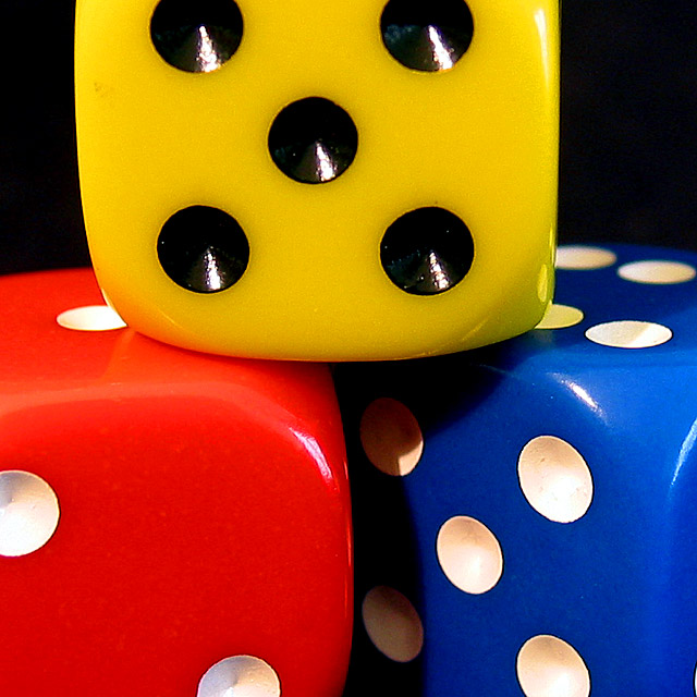
IMO, this photo showed primary colours the best of all the entries to the challenge. Three dice, three colours, you can mix them any which way you want - good idea. I was surprised it didn't end higher (although you can't complain, 12 out of 99 is pretty good).
The composition is very good. The shot is cropped just right. The 1:1 aspect ratio accentuates the squareness of the dice. Lighting is perfect for the shot. DOF is very good: I like it how, even though it a macro, you get a sense of depth by the blur at the back of the red and blue dice. Like I said below, I love it that the dots on the yellow dice are black, and on the other two white. Good touch.
The only thing I can think of to improve this shot is possibly working at getting rid of the reflections of the white dots from the blue dice on the yellow dice, and the little smudge towards the top and left of the yellow dice. Maybe not.
Anyway. Keep up the good work!
Ursula (uabresch)
Please feel free to contact me with questions, comments, complaints ...
You colors are nice and the layout pleasing... I do feel that the light could have been diffused so as to lessen your reflections in the black on the yellow dice. Overall, above average shot.





 Add photograph to your favorites
 Add photographer to your favorites

 Photographer found comment helpful.


