Rotate CW 90
Brightness & Contrast: Curves (160, 153)
Brightness & Contrast: Clarify (+1)
Brightness & Contrast: Brightness 0, Contrast +3
Hue & Saturation: Saturation +30
Color Balance (10,0,-5)
Sharpness: USM (.50,100,0)
Crop
Resize
Borders
Save as JPG
Sharpness: USM (.50,100,0)
Save as JPG
**************************************************
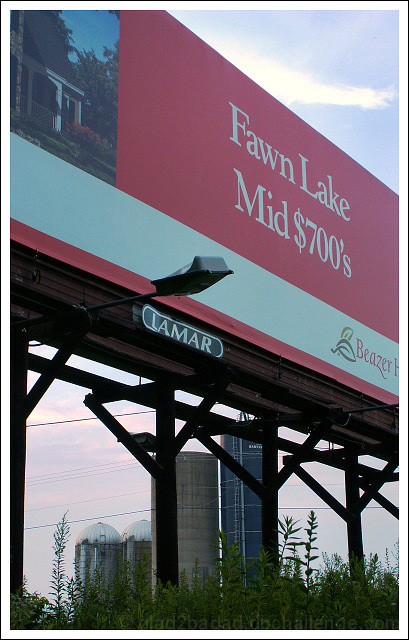
Amazing to see advertising for homes substantially exceeding the area average price like this. It's like advertising snobbishness (sp?). ;^)
Had to get way off the road and into the mosquito and tick infested woods to get this shot with the farm in the background. The farm is actually all the way across both sets of this double-lane road.
Statistics
Place: 183 out of 232 Avg (all users): 4.3601 Avg (commenters): 5.5714 Avg (participants): 4.2667 Avg (non-participants): 4.4031 Views since voting: 1125 Views during voting: 421 Votes: 286 Comments: 9 Favorites: 0
I remember this shot well from the Affluence Challenge. I thought it was very clever and a strong emotive statement. The result though wasn't as impactful as it could have been. Not sure if it was the crop or the clutter in the foreground or the fact that the farm isn't quite as visible as it might be. Regardless, I did (& do) think it was a good entry.
I love the political statement made by the framing. But I find the composition a little cluttered; I wonder if B&W might make the sign feel a little more shadowy and sinister - in the way I think you mean it to be?
There is nothing wrong with being clever, but when your image idea goes swooshing over the heads of your viewers, it's not good photography. "Irreversible"?







 Add photograph to your favorites
 Add photographer to your favorites

 Photographer found comment helpful.


