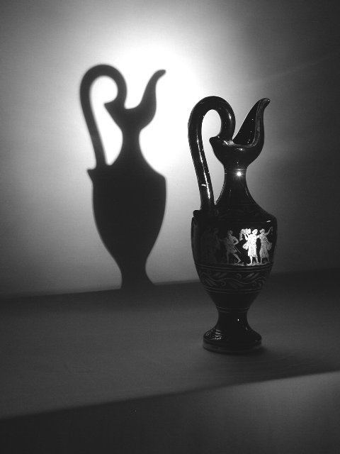
Great lighting, though the shadow seems more of the subject when it shouldn't be. Moving the framing over to the right some to make the vase in the middle and the shadow on the left couldve worked more effectively.
Good use of light and shadow, but I do have a couple of suggestions. Don't know how much control you had of the setup, but it might have been nice to have the bottom of the shadow connect with the bottom of the vase. The edge of the platform at bottom doesn't do much for me, and I'd like to see the people on the front of the vase arranged so that the light falloff doesn't cut anyone in half (while maintaining that perfect profile shadow, of course). You obviously know what you're doing - just my thoughts. Nice work.
I like the idea, but I think, compositionally you might have made a better choice of framing....maybe even a real tight shot of the vase, foregoing the shadow.
Nice shadow work, very nicely done set shot. Great lighting, personal taste, maybe aimed a little high, but then the table might have been more of a distraction, so let's go with the benefit of the doubt, GREAT shot!!!! Photo 10 Creativity 9 B&W 10 (could you have made the table disappear more?) total score 10 (one of the best this week)
Very nice use of light and shadow. I would like to see more of the detail on the art on the vase, but that is more of a personal comment than a criticism of how you composed it. The light and shadow contrast is pretty striking.
This is a great photo... I like the lighting and the contrasts offered here... I don't particularly like the diagonal across the bottom and I think that some small amout of left side lighting that would have highlighted the designs on the left side of the vase would have been nice as well... I'm not sure of it but this photo may have been slightly over sharpened... in the curved handle of the vase, i can see some jagged edges that are sometimes produced by over sharpening... good photo!





 Add photograph to your favorites
 Add photographer to your favorites


