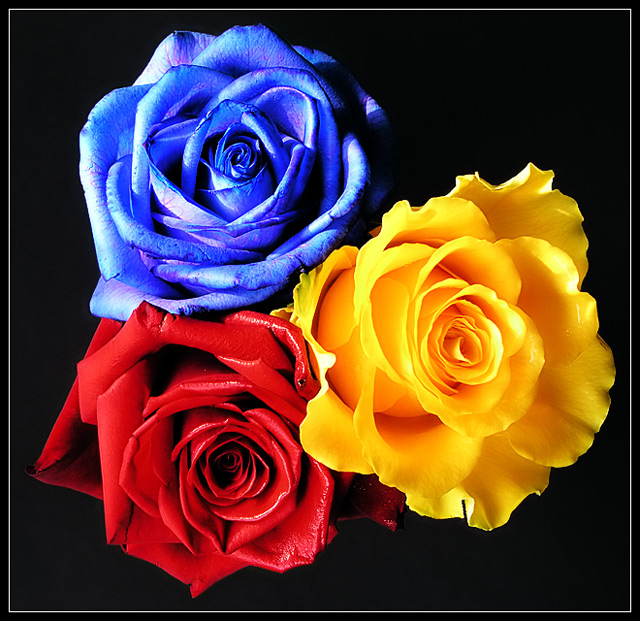
This picture is full of life - full of Summer. It's Beautiful. I tend to focus in on the Yellow Rose ,,, but I keep moving my eyes towards the Blue Rose. I can see the "veins" in the petals of the Blue Rose whereas the Yellow and Red Roses are without "veins".
If there is a story here would it be that the Blue Rose is struggling to become as "perfect" as the other Roses ??
Bear with me. It should not make a difference whose picture you're commenting on, but it does ... and you're successful at this site, which makes your work harder to comment on. Oh well. Here it goes.
I am going to be blunt. When I first saw this photo I didn't like it all that much (ouch, please don't hate me!). Technically very good, but emotionally it didn't work with me. The photo seemed "harsh" and the border bothered me. I gave it a 7 because it is a good photo. As I look at it more, I like it better, especially for the detailed, crisp edges on the yellow rose.
The composition is good, even though the photo showcases the three flowers without telling a story. A bit disquieting to me is that my eyes don't know where to look here, they tend to jump from one flower to the other, without a place to rest. Also, even though the picture looks square, it's not a perfect square - I wonder if that would make a difference?
Technically very good. One could argue that the lighting is a bit harsh, especially on the blue rose. I'm wondering, would it have made a difference if the blue and red roses exchanged places?
The border, well, I can see where this border works here. It adds to the high impact quality of the picture.
The photo meets the challenge head on, no problems here.
I guess you can tell I have mixed feelings about this picture, and I read the comments below and see your score and seem to be way off track. But to me, even though it is a good photo and your score reflects that, this one doesn't do it. I love the yellow rose, the other two not so much.
I guess this is where I get to say, "Keep up the good work!" (Duh!). I very much like your positive attitude at this site. Reminds me of a good friend of mine, she's highly competitive but always kind.
Thanx for all the comments. The textures in the blue rose come from the dying process at the florists. This was originally a white rose and which was placed in water with blue dye in it and slowly turned blue. It isn’t possible to get a perfect blue though and this is the best which could be achieved. I also sprayed water on the roses to bring out the colors more. The effect seems a little oversaturated as some have said, however other than cropping and resizing I didn’t post process them at all.
I also came across some Blue Roses a couple of weeks ago, but was too chicken to submit to the Flora challenge. The ones I saw have crystals on the edges of the petals as if they'd used a sugar solution to dye them...your's look a little blown-out on the edges of the blue petals -- maybe a light diffuser would help there (my flower photo has a similar problem...sigh).
This is a nice idea, but the colors seem too fake. Are they oversaturated or overly adjusted? I'm not sure what it is, but the lighting also seems harsh causing them too look fake.
Your composition and layout are nice. The colors on the black work to make a powerful impact on the viewer. I would like to see the saturation turned down a little. It's almost to much as the blue looks too hot. Nice shot. 8 -danny






 Add photograph to your favorites
 Add photographer to your favorites

 Photographer found comment helpful.


