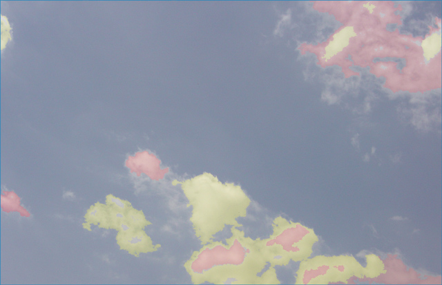
my first impression of this picture was non-committal, I personally do not find much of interest in this image. I does have a certain appeal with the discoloured clouds but overall I think it lacks that something that would make me take a second look.
In terms of meeting the challenge, technically it is within the boundaries set out for primariy colours. I would like to know if this was your inital idea or was it an afterthought?
Technically the image is sharp enough and seems to be within acceptable exposure levels.
Overall I think in a literal sense this image is not strong within the guidelines of the challenge and consequently has been voted down accordingly.
Perhaps it might be worthwhile adding some comments to the Photographers comments field in order to allow us a retrospective view of what you were looking to achieve with your images.
This photo looks very "washed out" to me. I'm not crazy about the way the clouds and the sky look - there is not enough contrast, and really nothing to catch my eye, nothing dramatic, and the photo has very little impact for me. I just don't like this treatment for this challenge.
I see what you were trying to achieve here, but I just can't say it worked. The cloulds look fake and totally digitized and over processed. Looks more like a doppler than a photograph, but I applaud your idea and your creativity!
Interesting place to try to find primaries - but the colors are too pale, and the composition too random. Perhaps a bolder sunset sky would work better?






 Add photograph to your favorites
 Add photographer to your favorites


