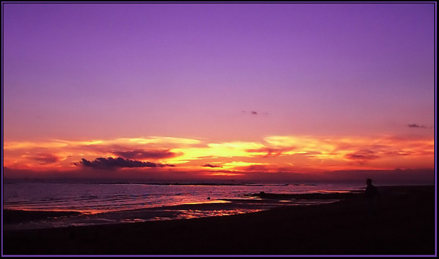
This photo was taken at a Melbourne Beach. I was lucky with this shot, as I had gone out hoping to get some great sunset shots, but had left my memory cards at home, so only had the very limited internal memory (5 photos max) to work with. I have brightened the colors a little, to make the photo what it is, and had to rotate it 1 degree, to make sure it was 100% straight.
I know some people will most likely recommend that I crop more of the top, and I can see their point, but I also love the color of the sky, and think the photo is perfect as is.
I am definitly very proud of this shot and I am hoping it ends my steak of 4.0's scores, and get my first 5.0 score. (Not including my sticker)
Statistics
Place: 39 out of 225 Avg (all users): 5.8978 Avg (commenters): 7.0667 Avg (participants): 5.7157 Avg (non-participants): 6.1190 Views since voting: 2451 Votes: 186 Comments: 20 Favorites: 2 (view)
Well, so you wanted to get your first 5, and you went almost to 6! Now that's the way to do it. And you have the second spot for your camera. Congratulations!
Your "Secondary Colours" photo is very beautiful. The colours are the best part of the picture. I would not crop the top, not at all, the purple sky is perfect as it is. I think it's a good idea that you went with your gut feeling on this. I love the low horizon line, the reflections on the water, and the little tiny dark clouds in the middle and to the right.
The photo looks ever so slightly out of focus to my eyes, but in this case I think it actually helps. I don't think good photos have to always be perfectly sharp - clear, yes, but that's different. I like the way you managed to keep the purple sky so smooth.
The border is a bit uneven, at least that's the way it looks to me. The outside black line is wider on the right and narrower on the left than on top and bottom. Also, the inside black border merges with the picture at the bottom, making the purple border look slightly like an optical illusion. IMHO, this picture would look better without a border, or with a very simple border (e.g. a white mat). The picture speaks for itself, the border it has now doesn't really enhance it.
A couple of your commenters below mention the person's head, but on my monitor it hardly shows (it's amazing how different pictures look on different monitors). One idea that I've been using is to create 2 copies of my entry, one lighter and the other darker than the actual submission, and view them to try and see how my picture might look on other people's monitors. You pick up stuff about your picture that way that you might miss otherwise.
OK, I'll quit before I bore you to death. Again, congratulations on a very good entry. I'm looking forward to seeing more of your pictures. Take care,
Amazing colors here! Is that a person in the lower right part? If it is, it's either too much in the shot or too little, if you catch my drift. Love it - 9
The person on right side of the frame is distracting. Cropping that part of the image out may have improved the composition. The exposure seem right though.






 Add photograph to your favorites
 Add photographer to your favorites

 Photographer found comment helpful.


