Author Thread Comments Made During the Challenge
Post actions
Post actions
Better if the bill was a C note!
Post actions
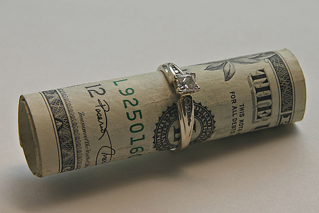
Tack sharp. I see the and feel the rag paper of the bill. 7
Post actions
Making the money equally balance on the ring would have made this a Money shot. The money is resting on table on the right side. Great idea. 95% execution The small wrinkle in the Bill is a slight distraction.
Post actions
Post actions
Post actions
I like the simplicity of this shot. Maybe some stronger light would have mage the stone more sparkly but that i difficult to do I know. Good luck
Post actions
Not my preference, but technically a great photo.
Post actions
I am not crazy about your title - but the image is good. Maybe "affluent proposal" would have fit better?
Post actions
Post actions
Lighting seems a little dark. Different background color might make it "pop" more.
Post actions
To me this is Affluence. Diamonds, Jewelry and Glitz with money wrapped up in it, all through it and all just for show . . . an expensive napkin ring. I love this photo. 9
Post actions
Composition, POV, DOF: 1/2
Post actions
I would of liked a different coloured background on this! But, well done!
Post actions
Post actions
I like the idea but don't like the composition of the image. 5







 Add photograph to your favorites
 Add photographer to your favorites


 Photographer found comment helpful.


