Your lighting seems pretty even. I think you may have oversharpened this some -- sometimes less is more when it comes to sharpening. You may want to search for a method called 'lab sharpening' as it seems to give a better result when a lot of sharpening is needed.
As far as composition, it's decent, but nothing that really pulls the user in.
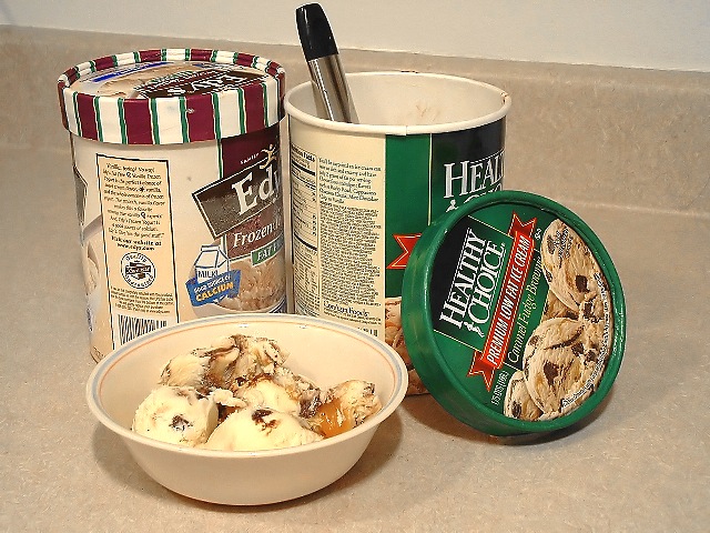
Picture this shot as an ad...the bowl in the lower right corner, one opened container behind that and to the left..but higher in the frame. One thing I've noticed seems to help with a shot like this is to crop. Take your mouse and position it in the center of the image...now drop it down about a half-inch...that is the 'visual center' of the photo as far as a viewer is concerned. Now that spot should fall somewhere between (or relatively close to) an imaginary line between the two spots of main interest in your photo -- when this happens, the viewer's eyes will flow nicely through the picture, and stop wherever he or she chooses.
Nice shot though nonetheless, and a creative idea. You have some really good shots in your portfolio, so keep shooting...and focus on that composition.
That is my favorite kind of ice cream. Caramel Fudge Brownie. I could eat the whole carton. Nice composition by the way -- even if I got distracted by the munchies the minute I saw it :)
I love your interpretation of the challenge. The colors and clarity are excellent. It appears to be a little oversharpened -- it shows up right around the lines in the photo.
fun shot. i hope you're looking for feedback, if not stop reading. from a product shot perspective...the focus is good. the appeal isn't quite there. that large piece of carmel in the bowl looks a bit awkward. you really needed to pile the ice cream in so the bowl was full, as is it still looks empty. i think you should have stuck with 1 tub, unless your intent was that you ran out and always had room for another, then i would have used 2 of the same brand. but the shot feels cluttered with both as it is. the half frozen, half thawed of the edy's looks strange. the counter isn't a terrible background, but showing as much as you did is. the countertop lines are incredibly distracting. maybe they wouldn't have been so bad with a straight on shot, but the angle you've chosen makes it very noticeable. the coloring is too yellow, adjust the white balance for a more natural look. with the shot you've chosen, might help to have all the logos facing front. hope this long winded commentary helps with your next photo.
The tilting of the container is somewhat objectionable but I guess there is not a legal solution to that.......8
Maybe propped it up by placing something under the left container?
Seems oversharpened or incorrectly resized (lots of jaggy lines) Also the lighting is a bit flat and uninteresting. The composition and background also look like not much thought has been put into them.
Only comment I have is that there are lots of jaggies, maybe the way you scaled down the image did this? It looks like no interpolation was used, try using the Cubic resampling method.






 Add photograph to your favorites
 Add photographer to your favorites

 Photographer found comment helpful.


