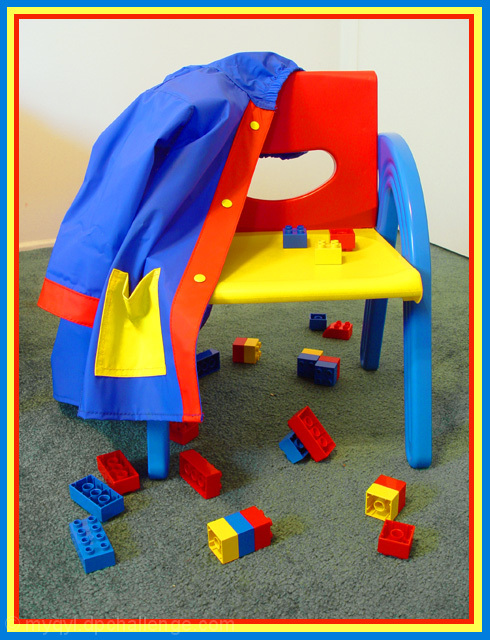
My daughter is obsessively neat, so I had to set this up. She kept wanting to pick up the legos and put them away. I tryed a few different aperatures etc, but thought these colors came out best. I like slow shutter speeds for some reason. I saturated the whole shot about +30 and turned down the green channel to mute the carpet a bit.
Statistics
Place: 42 out of 99 Avg (all users): 5.7381 Avg (commenters): 6.3077 Avg (participants): 5.9444 Avg (non-participants): 5.4630 Views since voting: 988 Votes: 126 Comments: 16 Favorites: 0
Composition The legos are so messy and the jacket is hung up so nice and neat. I'd have knocked the chair over, strewn the jacket on the ground and had a kid passed out in the middle...but that's just me! lol Anyways - it's a good setup here.
Color Unreal beautiful colors! I even like the border, as I said in my comment during the challenge!
Lighting I like it - except for the diagonal shadow along the left. Too bright and you blow this shot out, too dark and the vibrancy is lost from the colors - beautiful medium here!
Subject matter When I think bright colors, and primaries, I think children too - good setup, obviously meets the challenge, and does it very well.
Overall Congrats on the pic and the above average score. Keep shooting!
I love the composition of this shot, but I think if you could have placed a solid color (white or black perhaps) under the chair and toys, it would have been more effective. The color of the carpet seems to take away from the strength of the primaries. Also, on a side note, and not related to your score at all, the broad yellow band in your border really pulls the eyes out of the picture. Maybe if the red and yellow were reversed.
This is cute, and definately fits the challenge. I think the border is a little overkill though. Focus, and lighting appear to be good. I do wish though that there could have been a bit more lighting under the chair as to not mute the colors of the blocks under the chair. Otherwise, a nice job! ~Heather~
Great concept. Focus looks good. I think maybe taking the shot from lower angle and shooting up to have the white wall behind it and get the grey carpet out would have given more impact. Doesn't affect the score, but the border is hideous!
I think this image is ok overall, but the border is too loud and it is competing for attenion. Borders should be supportive of your subject and not distracting from it.







 Add photograph to your favorites
 Add photographer to your favorites


 Photographer found comment helpful.


