|
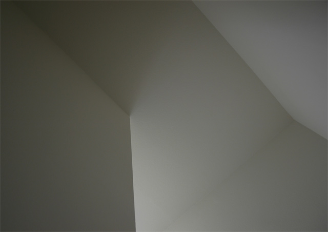
cool idea. i wish the darks were darker and the lights lighter...i guess that's more contrast. but it's not even that...i think you needed at least a secondary light source to really make your lines more interesting. like the line from the right side to the bottom...that needs to be stronger some how. also the left panel feels a bit heavy in the pic (compared with the upper right), i would have cropped out some of the left, probably to the corner at the top. maybe it's just me as ii think i said that on another pic :) just keep up the interesting ideas. |





 Add photograph to your favorites
 Add photographer to your favorites


 Photographer found comment helpful.


