*Critique Club*
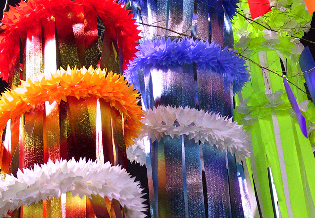
This shot is a little busy for me. The part that bothers me most is the tree branch that pokes in front of the blue and yellow decorations. The colors are good, but I think that for this challenge there are too many, and the right ones are not the center of attention here. You have cut the red one off at the top of the frame. I do think that the red one should be in the shot more.
The lighting is a big harsh on the left side of the shot. It completely washes out the color in some spots.
I think that the angle is ok. It's not a dead on shot, which does create some interest.
The yellow seems more like a yellow green, but that doesn't bother me at all. I think that with the other colors in the shot, the yellow/green works better than a regular yellow.
Focus and clarity are good. Nice crisp lines. I like the detail in the flowery rings around the ribbons.
I guess it's technically alright except for the lighting, but it's just not my cup of tea.
~Heather~
I like the colors here, and the strong vertical "motion" However, at the risk of sounding nitpicky, I do think it would have been more effective (for this challenge, anyway) to include only the primary colors adn not a wide spectrum. But that's probably just me.
Looks like Prom decorations. Nice color and composition. A touch harsh lighting in the left side on the tops of the lai's (sp). The red looks a bit washed out from it
Simple, silly and goofy, but it works for me! Your colors may not be true blue, yellow and red, but what the heck! I do think that you may have wanted to meter on the bright reflections to minimize your hot spots. 9 -danny





 Add photograph to your favorites
 Add photographer to your favorites

 Photographer found comment helpful.


