*Critique Club*
I already wrote some words on this, so I'll try to elaborate on what I said previously in my comments.
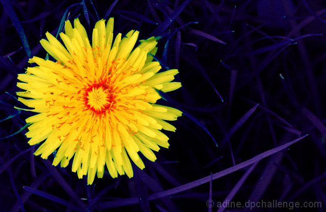
I said that I do like the angle and framing/cropping. The from the top angle gives us a nice look down into the flower, and lets us see the red really well. That is important for the purpose of the challenge in my opinion. I like the negative space to the right, and think that that aspect really adds to the shot.
Your focus and clarity are good. The blades of the grass and the petals on the flower have nice sharp, crisp edges. The red areas in the middle appear a bit soft, but I think that's probably only due to their very tiny size.
The blue grass still creeps me out. I'm wondering why there are still some traces of green in areas of the grass. To the left of the flower for example? This seems strange. Well, not quite as strange as blue grass in the first place. lol The one blade that is giving off the hint of purple is a bit distracting, as it is a different color than the rest, and it is such a strong line through the photo.
The grass does help the flower to really jump out though. The dark color of the grass background really lets the bright yellow scream.
~Heather~
The angle and framing/cropping are really good. I like how you have put the flower to the left of the photo. That makes for something nice to look at. The blue grass kind of freaks me out. Otherwise, it's a good shot. Focus and clarity are good, and the color really jumps out of the photo. ~Heather~





 Add photograph to your favorites
 Add photographer to your favorites

 Photographer found comment helpful.


