First off, congratulations on your award. This photo is very deserving of it.
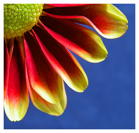
My first impression was the gorgeous colors in this photo. It certainly meets the challenge very well. I'm sure you boosted the saturation and levels a little to make it pop out but it still looks natural. I like the highlights near the edges of the pedals. They really help to define that edge and the separation between the flower and the blue sky.
The lighting is very good in the way that it creates some nice dark shadows on the pedals and at the same time highlights the center area. Each element of the photo from the sky to the individual parts of the flower are distinctly visible with the right amount of light.
The focus is pretty good, excellent in most of the image. Since it is sharp in nearly every area of the flower I would like to see that taken even further by decreasing the aperture size to the smallest size of F8 (whatever the smallest is on your camera) to try to get that lower pedal more in focus. Hey, it's such a great photo that I am grasping at straws to come up with something to nitpick.
The composition is very appropriate. It is a common composition for these kinds of flowers but that is because it works very well. The square cropping was definitely the way to go.
You executed this image very well and produced a very clean, colorful, and dramatic photo that I'm sure would look great on just about any wall. Good job.
I really like this shot. the composition of having it "quartered" really adds interest, adn the colors are so rich and pleasing to the eye. Excellent work.
The colors mix well together here. Did you bend the flower down and shoot from below it? The sky in the background has an amazing tone of blue to it, crispy!
Nice closeup...your colors are oversaturated and the contrast is a little too high. There are dark shadows in the petals. You need to play with your light source to get a little more light on the flower, instead of using programs to adjust. Or maybe you used a flash/ They are too harsh on a closeup like this. I am only guessing that this might be the problem. The composition is good, the bckground color is good.
This is very striking and I like the composition. The border isn't right for the image in my opinion. I like the slightly mottled appearance of the background blue.
I wish the pistil/stamen were more yellowy instead of green, and I can't imagine that's much more than a hue adjustment - the red/yellow/blue you have here is absolutely wonderful. The composition says that you knew exactly what you were going for here - the blue negative space is excellent. Great all around. 9
Although we have had many flower shot recently, this one stands out nicely. It meets the challenge very well and I love the soft tones throughout. 9 -danny





 Petals
 Add photograph to your favorites
 Add photographer to your favorites

 Photographer found comment helpful.


