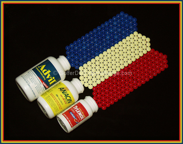
OK, you are right. Advil tablets are orange-brown. These are actually Tylenol PM tablets. I thought it would make more sense to have three different brands. The Anacin tablets are actually the opposite side of the red tylenol tablets. Forget the specifics. Its just Art!
Statistics
Place: 22 out of 99 Avg (all users): 6.1736 Avg (commenters): 6.6667 Avg (participants): 6.0822 Avg (non-participants): 6.3125 Views since voting: 1525 Votes: 121 Comments: 21 Favorites: 0
First impression of this image, well executed. It is well balanced, though I will go into the cropping shortly. And as you have no doubt been told, the border is a bit distracting.
This definately meets the challenge and you have found a unique way to represent the primary colours. It's a shame the yellow pills were not a little more yellow, but they are still clearly yellow. I would say more saturation would bring the yellow out but that would be at the expense of blowing out the yellow on the pill bottles.
I think the thing that could improve your image alot is the composition, I think a tighter crop would have made for a more visually appealing shot. It is often tempting to show the entire subject within the image, but look at alot of the really strong visual images and they give you enough of the image to identify it but not the entire subject. I think this shot would have more impact if you cropped out alot of the pill bottles on one side of the image and spilled the pills out the other side of the image. But still maintained the diagonal, which I think works well.
Technically you have executed this quite well, perhaps it could be a little brighter in order to give it a little more punch. But otherwise it seems technically well done.
Overall I think with a little more work this would be a really strong image and I think it was an excellent idea.
Amend -- Great work on the composition. It has a strong, stable feeling to it. Two minor nitpicks. I think a tighter crop, even one that had the subjects "spilling" out of the frame would have been effective, and the border bothers me. Doesn't affect your "score" but I do think in this case it effects the overall effect of the picture. I find myself drawn to the yellow line instead fo the bottles.
Clever set-up, very creative. The result is good. If only the yellow tablets could have been the same color as the yellow on the bottles and the border this would have been a killer photo - 8.
Great idea and original. I think the contrast could come up some . Just a bit dull in the colors. A touch more diffuse lighting may have boosted the color and made it a bit more vibrant. Not that it matters on my scores, but I hate the border.
Must've taken forever to arrange them like that! I like the black background, but you have sacrificed the brighness of the colors and the white pill bottles to achieve it, I'm afraid.
What a great subject! I only use straight aspirin so it never would have occurred to me that pain relief actually comes in primary colors -- good work!
That looks like it requires a lot of patience. I have to be honest though and say that the yellows aren't too strong and it takesa away from the picture a little bit.
You know what's really amazing... the detail. The little "pills" are all laid out perfectly, and even the bottles are increasing size, making use of the picture area. Really great.
Have a headache? :-) The time to lay those out paid off. The symmetry is nice. I do feel however that the lighting and saturation make the photo seems flat. Boosting the saturation and contrast may have made this a more lively photo.
just don't do them all at once. very creative idea and nice frame. the lighting is just okay and the colors look a little dull, however, and could have benefitted from a boost in saturation to give them more zing. a lower angle might have made the perspective more interesting as well.





 Add photograph to your favorites
 Add photographer to your favorites


 Photographer found comment helpful.


