*Critique Club*
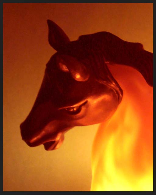
Very nice colors. Definately fits the challenge. The lighting is really good.
However, I think that the lighting is the main cause of the biggest problem with the photo that I see, which is focus. It is soft focus on the horse, and blotchy in the shadowy areas.
To help out with the focus issue, you should not try low light photos hand held. Always put the camera down on something, or use a tripod. Another suggestion would be to (if available) use the timer or remote. This will prevent camera shake because then you don't have to push the button and rish moving the camera.
The angle and framing/cropping are nice. I like how you have focused on just a small part of the horse, and not the entire horse. I think that by doing it this way, you have also increased the effectiveness of the color, which is very important in this particular challenge.
The background is good, no distracting elements in the background, however, it is blotchy, from what I believe is the low lighting.
I really like the shot, and I think that it would have done a LOT better with sharper focus.
~Heather~
Lovely concept, and very well-lit. 8. This could have gotten a 9 or 10 from me if it were better focused/sharper - as it is, the colors seem to define blotchy areas, instead of a solid shape.
Interesting effect. Shot looks quite noisy - I would investigate setting your sensitivity (ISO) low and using a longer exposure, if your camera will let you.
Great idea, and the 'fiery' colour is superb, but this lacks enough sharpness to bring out the detail. The dark areas could probably do to be a bit darker too, as it is it seems a bit noisy in the shadows.
Good composition, and I would like to know how you achieved the effect with the colour.
Nice angle on the head, I assume the focus is delibarately soft. Only point I would make is the pixelation that occurs around the ears, perhaps this was down to some filtering or resizing.






 Add photograph to your favorites
 Add photographer to your favorites


 Photographer found comment helpful.


