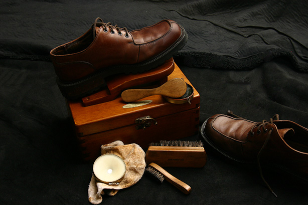
nice lighting here but the composition just doesnt work well for me. perhaps with the shoes more to the left. the shoes either need more breathing room on the right/bottom or shoulld be cropped tighter i feel.
I think composition is a bit cluttered, just one brush, rag and the polish would be enough to convey the idea. The footstool thing looks nice with the lighting, I like the lighting. Wish the background was all blak or something else... not bad though 7.5ish
Very nice lighting. I like the set-up, but there's something about the composition that's making me want to push the other shoe into the frame. I feel like turning my head to the right. I think it's because of how much space is left on the left and how much has been taken from the shoe on the right ..






 Add photograph to your favorites
 Add photographer to your favorites


 Photographer found comment helpful.