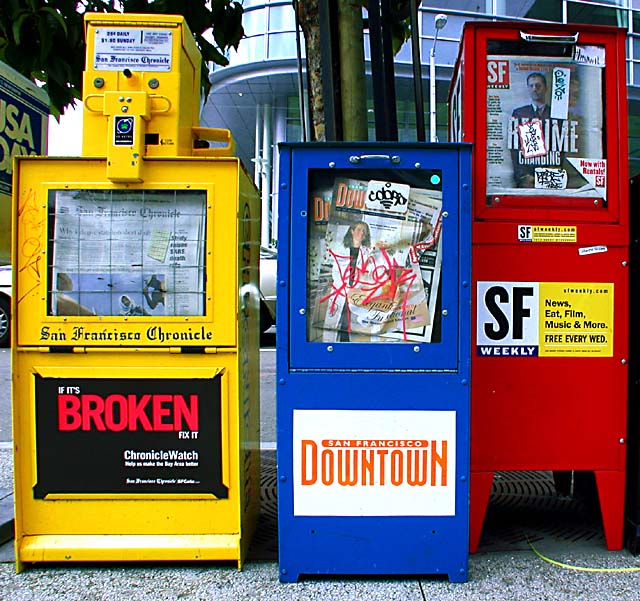
Think this scored pretty well - one of those shots I don't understand why it did so well. The things that bother me: the barrel distortion, the confusion of the background and the stickers, and the relative positions of the boxes themselves.
Obviously the colour is fine, focus is fine, and challenge appropriateness is good. My immediate reaction, and after looking for a while it hasn't changed, is 'it's just a photo of some newpaper dispensers', and there's nothing there that makes it any more for me: perhaps if you'd included MORE background you could effectively have contrasted the colour with the rest of the street? Or perhaps a more unusual angle to shoot from would have helped.
I just find that very head-on shot, well, boring, I'm afraid. This is not to say that it isn't an entirely competent shot, but it doesn't have anything unusual about it.
It's ocurred to me that the barrel distortion may have been deliberate - in which case I think you need more of it: here is looks like an accident I think.
Just my opinion, of course; 5.6 is pretty respectable :-)
Dangit. You did my idea, only far better. Good for you. :-> Crisp focus, nice lighting, good tight crop (to exclude, I presume, the really distracting background).
I thought this was a good photo because it was not "staged". The photographer had a good eye that caught something that you normally would not take a photo of...but it shows everyday life.







 Add photograph to your favorites
 Add photographer to your favorites


 Photographer found comment helpful.


