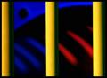
I instantly liked your image when I saw it ... the very simplistic colorful curves are beautiful. Abstract, but not too abstract to recognize what I'm looking at.
CHALLENGE - Well, you used all the primary colors, so it most definitely meets the challenge.
COMPOSITION / CONTENT - The composition is very well thought out. On the right, each of the bowl meets the edge of the photo right about at a third, which makes the image very pleasing to the eye. It's the lighting though that makes this image special because other than the rim of each of the bowls, the rest seems to disappear into darkness, almost the same color as the background, but not quite.
CAMERA WORK / TECHNICAL - The focus seems to be just a little tad off in places to me, mostly on the blue bowl. Other than that, I can really just repeat that I like your lighting setup here.
POST-PROCESSING - A little more unsharpen mask would probably help my perception of parts being out of focus, and, even though I suspect you went with the more subdued colors to match the curves, a little more "pop" to the colors would look nice IMHO.
MY OPINION - Well, I just read the comments that you got, and I think I'm all in line with the voters that commented. You have a beautiful simple image here that met the challenge very well and deservedly scored well, too. Just a couple of post-processing steps would make this image even more outstanding. Great work!
Please let me know if you have any questions or comments about this review.
Excellent composition. Maybe a little dark overall.
The red line along the outside of the yellow dish(?) and the noise in the blue area just stop this from being a 10.
Excellent composition!. Not sure if the soft focus is intentional, but I would like to see it sharper on the rims of the subject. Low key, but this works great here
Very nice idea. Great job! I wonder how a landscape layout or crop would have looked. (I think it is benificial if the voter can see most if not all of the image without scrolling)







 Add photograph to your favorites
 Add photographer to your favorites


 Photographer found comment helpful.


