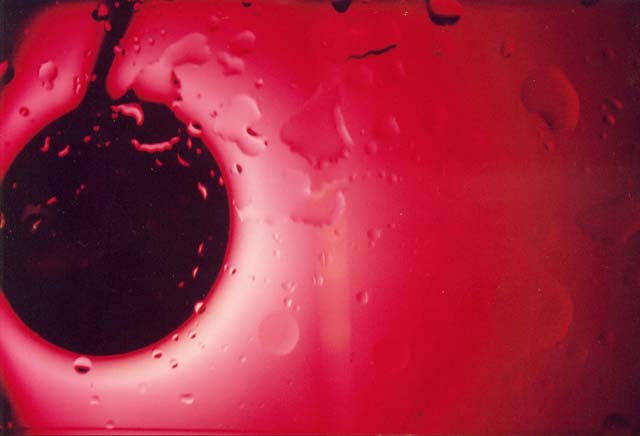
General: The colour is vivid. This is what initially catches the viewers attention. I think the focus is a little soft though. It's hard to tell where you want the viewer to concentrate their attention. The texture of the divits on the surface would have been brought out more if the focus were sharper.
Composition: A little less zoom and also positioning the dark area lower and to the right I think would help here. It just seems very crowded and too central on the vertical axis.
Exposure: Exposure seems right. The light to dark transition draws the viewer into the picture.
Impact: Impact is achieved through the vibrant red colour and the light to dark transition.
What is it? My guess is that it's a buoy attached to a fishing net (or something like that)






 Add photograph to your favorites
 Add photographer to your favorites

 Photographer found comment helpful.


