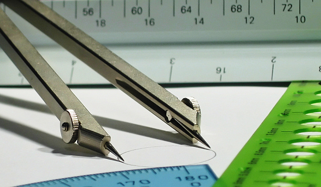
8 - Met the Challenge. I like this shot it is very clean and captures the 'feel' of the compass well. The colors are simple and there is no clashing and given the subject I do not think anything bolder is required as it would make the silver 'metal' of the compass 'fade'. Criticism; I would like to see even more sharpness on the compass, more emphasis somehow on it. Maybe a tighter crop taking out more of the top, but I realise you would then lose the rule there. Maybe turning that upside down to have the numbers and lines, as that would still fit in with the style/angles of the others. Perhaps more play on the shadow, not sure.
Good subject matter, good lighting nice shadow, however I would have preferred just one item in front of circle- perhaps on a 45 way over in the corner. Blue and green are conflicting and causing too much eye distraction. "8"







 Add photograph to your favorites
 Add photographer to your favorites

 Photographer found comment helpful.


