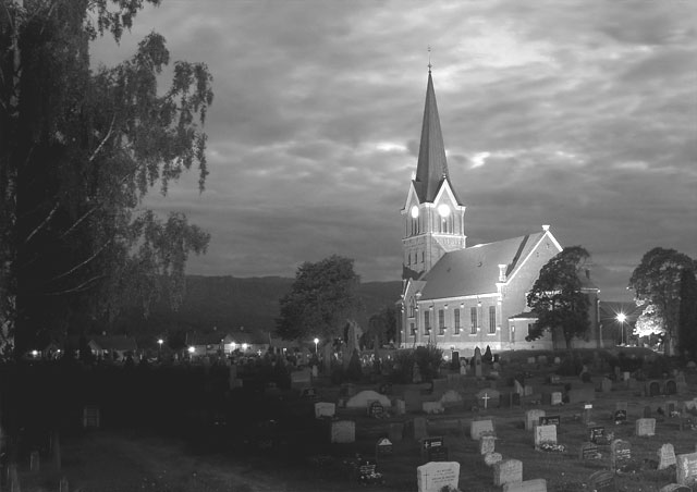
I also like this shot better than the color version. Have you tried what SJCarte suggested? I think if you edit in Photoshop and bump the contrast up a little and take the brightness down it will pop and also give it a spooky feel with the graveyard. Nice image.
I like this one too, but feel like there could be a little more contrast. The tonal range isn't quite what it was in color - something that I think could be corrected/improved in PP with a little tweaking. Still, a good shot in B/W too.




 Add photograph to your favorites
 Add photographer to your favorites

 Photographer found comment helpful.