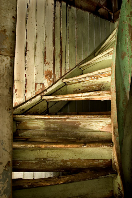
I really like this picture and the rustic"ness" of the wood, however, on my monitor, it has a green cast to it. I really think that these stairs would look better in B&W or even sepia tones.
I really, really like the composition and subject here. I think it would have had more impact in black and white, however. Personally, I think black & white would really help bring out the character in the wood and the peeling paint. Great shot!
Really pretty light and perfect subject matter...such character and depth...I really like those super subtle greens, just really nice...one of my favorties for the challenge.
In this challenge, "Creativity is the Key" is what I am using to score images. I really like this image. The twist in the stair (composition) and lighting are what make it work for me. I like that the stairs get lighter as they rise - they are leading me somewhere and the urge is to follow. The tones work well. You might be able to crop just a little bit on the left - the dark tones and flatness of that piece/wall are like an impediment to climbing the stairs. Make sense? Not take it all the way out but just limit it a little more. 8 - good luck in the challenge!





 Add photograph to your favorites
 Add photographer to your favorites

 Photographer found comment helpful.


