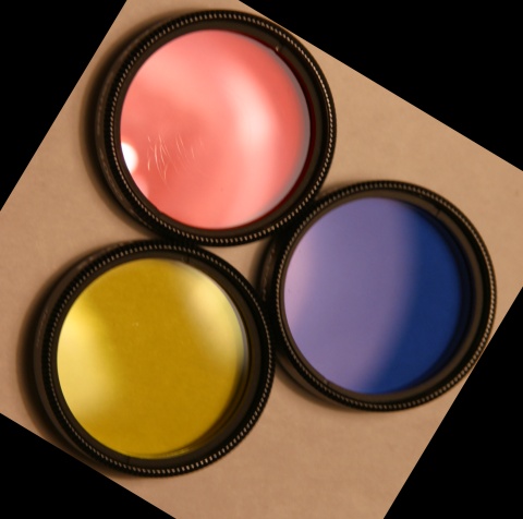
I think this would be better if the red were more RED, and less pink. The angle is a little off, I know a lot of people don't like symetry, but I wish this were a bit more centered and straight on. The glare in the red area is a distraction in my opinion. ~Heather~
Nice idea. A touch more diffuse lighting to bring out the detail on the rings a touch more. Most likely said before, but the cropping may have been better with a little more space around the filters to see the full shadows and even(ing) out the spacing, and then the rotation part not sure of, but making it a bit more symmetrical again with like a diamond in a square
I like the idea of using the filters -- and I find the arrangement you made for the photo very aesthetically appealing. If this were an ad, I'd probably think about buying them. :)







 Add photograph to your favorites
 Add photographer to your favorites


