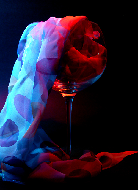
I like the concept of this one. Very good job. I would love to see what this would look like with it cropped to show just the right half - I bet it would be a very cool photo as well! :)
nice use of light.... the image stands up pretty well.... perhaps I would have blue lit the glass and red lit the scarf.... I think this would highlight the glass better and make for a stronger composition.... the eye is drawn strongly to the blue rather than the glass..... good luck, Todd.
Interesting set up, lighting, subject, and good saturated colors against the black background. The only thing I find distracting are the wrinkles in the material. Good work on the creative aspect, though.
The focus is mostly on the scarf and the colors, with the glass being secondary to the shot, so I have to grade this a little lower (even though it's a gorgeous shot!) to leave more room in my rankings for things closer to the theme.





 Add photograph to your favorites
 Add photographer to your favorites


 Photographer found comment helpful.

