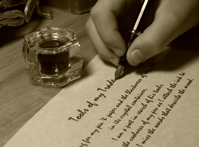
Love the idea, and the composition. My one criticism is the choice of font - it's very easily recognized, and makes it obvious that the page was printed and not actually written by hand. There are tons of free handwriting fonts available for download that wouldn't be so easily recognized. I love the creativity, though!
7 - Met the Challenge. The jury is still out on the 'viability' of this 'trade' however for now it is a 'pass'. Good attention to detail save for one thing (and I may be mistaken) but the last word written would be 'mood' and thus the pen there. Criticism; given that, and for other reasons, in my opinion this would be a better photograph if the angle were a lot sharper, from the page 'up'. A crisper focus on the pen/calligraphy would be better for me.
nice composition. It's cute that it says "tools of my trade", but it would be a better overall pic if it was something else more generic. Still, one of the better pics I've seen in early votiing.






 Add photograph to your favorites
 Add photographer to your favorites


 Photographer found comment helpful.


