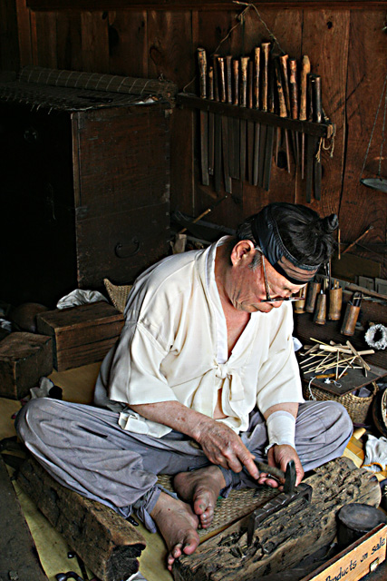
I like this picture. This is a bit nit picky, but I'm not a fan of the title. Also,I think if the picture were taken from a slightly lower angle, the depth of the picure would look better.
7 - Met the Challenge. Good character here. Criticism; I wonder how this would look in sepia. For me, if there was more depth of field (and yes I realise you might lose the tools at the rear) it would make it a better photograph in my opinion. I just noticed his 'headband' and his shirt - well that's different. The shot is just a little dark in my opinion and therefore the tools are getting 'lost'. A sharper focus, maybe a different angle (sacrificing the tradesman), may have made this a better photograph in my opinion. Given the sign "...products on sale", perhaps even a 'ground level' angle incorporating that and gaining the mentioned DOF may have given this an edge.
Something is strange about this photo - can't tell what it is - I keep thinking it might be a hair out of focus, but then I look at the lines and they seem ok. A great image though.





 Add photograph to your favorites
 Add photographer to your favorites


 Photographer found comment helpful.


