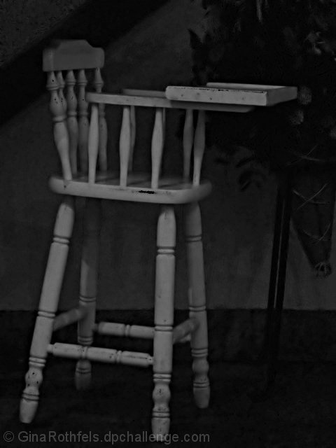
A good idea here. Nice subject, framed well in the shot. Seems like the focus could be sharper though. Maybe you were going for soft focus, but if so, it just doesn't work for me in this case. The chair seems to be tilted or something, that seems to be a little distracting. The image seems a little dark and washed out. Some simple adjustments in editing, maybe levels and brightness/contrast, could perhaps strengthen the presentation.
Its interesting that you were able to get a well focused image with the light such as it is. The image could use some rotation so the chair doesn't look like its falling forward. 4
This photo is lacking contrast and appears flat. The chair seems to be leaning to the left but I'm not sure if the photo is crooked or if it is the chair so I won't take off for that. (5)
This could be rotated a little and made brighter. The focus seems too tight (it appears like the front edge of the try is the focal point), and probably could have used some sharpening.







 Add photograph to your favorites
 Add photographer to your favorites


 Photographer found comment helpful.


