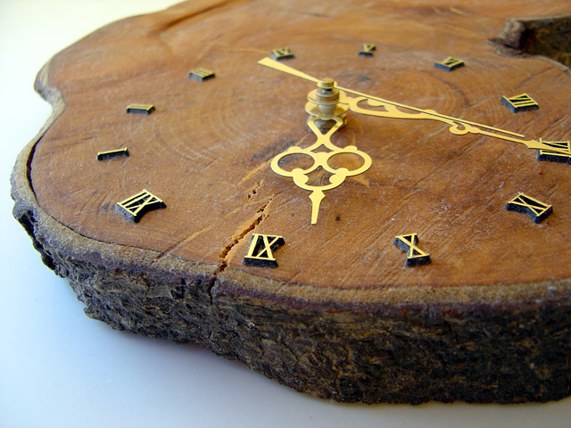
A bit soft in focus. In this case, a wider DOF might have worked better, at least to the extent of keeping all the digit of the clcok in focus. Lighting seems very good. Cropped / composed well.
Perfect title for this. Quite appealing too. In my opinion, it could only have been made better by using a different color (and maybe texture) for the table.







 Add photograph to your favorites
 Add photographer to your favorites

 Photographer found comment helpful.

