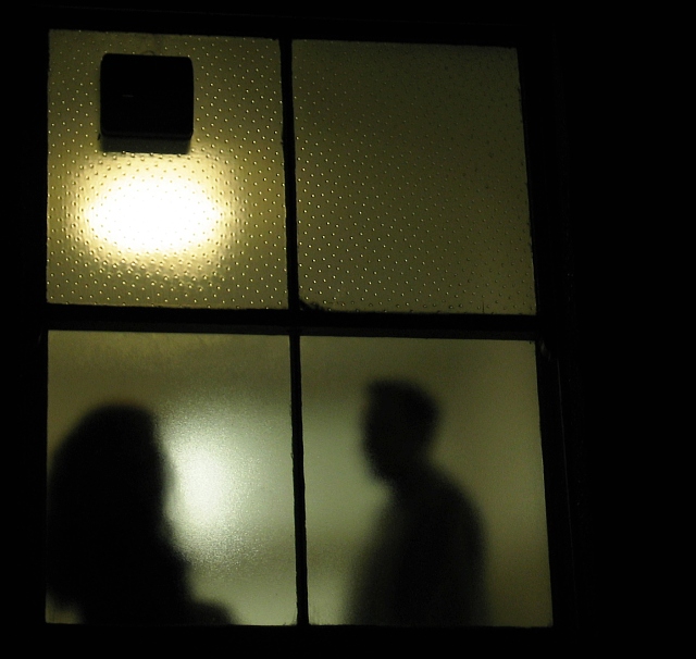
From reading your comments, and looking at your score, I suspect this is one of those shots that people either really like, or really don't like/understand it. I like the mysterious feeling that it gave. It reminded me of a spy show/movie, where the spy is on the outside, possible across the street or alley, peering at somone through binoculars. I found myself wondering if it was a shady deal going down, a lover's quarrel, or what. In that respect, your picture did a great job at presenting an open ended story. I think the yellowish/green and black of the shot is very simply and effective as there is nothing to distract the viewer from the subject(s) at hand.
The square thing is a bit distracting, but i imagine you couldn't do anything with it. I like the framing and composition. It seems a bit tilted at first, but upon second glance, it is more of your camera angle, I believe. Did you try cropping it halfway through the window? This would have made it long and narrow, but it would have gotten rid of hte top half of the picture.
Technically and creatively it is a well done shot. I am not sure what I could suggest that would make it tremendously better. I think it was just one of those subjects that either jumped out and grabbed people, or it didn't.
If you have any questions or comments, please feel free to PM me. Best to you in future challenges.
This should have scored much higher. It was quite different from most images submitted, nice soft light, and a meaningful title :) You're quite creative. Told ya, i would be keeping an eye on your (interesting) submissions. So, when you're not shooting, you're playing the voyeur, huh? :)
Too much space on top. I really like the silhouettes in the bottom but there is a lot of distracting space on top with the light and the funky textured glass.
Intersting shot. Makes you wonder what they're talking about. I find the light a bit distracing (top left pane) and the brown squar distracting too. Still a smart shot. Maybe crop out the top two planes. Thanks. Jacko. 7
Good idea. I think that this pic however, could have been shot in better lighting conditions. The way this image is taken, it doesnt provide for much interest.
This is one shot I think would have looked better with a perfect square framing of the window. The shadows and lights behind the glass would then become the main focal points, and balance the shot out (I think). The blacks look good, and the silhouettes look really good behind the glass.






 Add photograph to your favorites
 Add photographer to your favorites

 Photographer found comment helpful.


