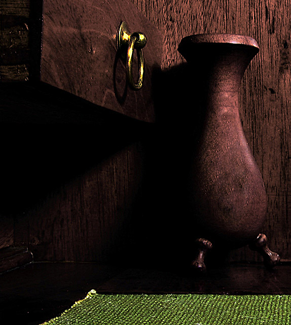
Straighened, cropped, Levels, Curves, Contrast with USM,Virtual Photographer, took out a few white spots (hot pixels), cloned out blownout highlights on vase,highlights on drawer handle were tinted in Microsoft Picture it. USM after saving for web. Antique desk and wood vase with light from outside, light in room and desk lamp light pointed above on wall.
Statistics
Place: 197 out of 251 Avg (all users): 4.8162 Avg (commenters): 5.0000 Avg (participants): 4.4771 Avg (non-participants): 5.3026 Views since voting: 803 Views during voting: 238 Votes: 185 Comments: 9 Favorites: 0
Although the image is a bit darker than what I usually like - the lighting and shadows reflect beautiful textures of the wood. The breass ring breaks up the darkness, adding the perfect contrast. The green rug is a big minus here - it clashes rather than enhances. I would suggest some hue manipulation to better blend it into the same color scheme of the brass ring and wood.
I find the rug distracting here...I think it is just too bright when compared to the wood. I like the shapes and composition, however. It seems that the wood is just a bit dark.
I like everything but the green mat. I find it to be so much brighter than the other elements that my eye is forcefully pulled to it and away from the other elements in the image.
I formed my opinion of the photo before scrolling down to see the green mat. So my comments will start out being based on that ... I love the tonality of the wood and the fact that it all matches so well. The soft but strong light is perfectly suited to the treatment; it looks especially good on the vase.
The mat adds interesting texture and color. It balances the brass ring. Yet, somehow it behaves in this picture a bit like an insistant child breaking in on a conversation between two septagenarians in their rocking chairs watching the sun set. If the mat must stay for some important compositional purpose ( I'm terrible at composition, so am unwilling to assert a judgement here) then I wonder if selective desaturation or hue manipulation might not soften the loud shade of green to a softer yellower shade that echoes the brass ring. In any case it's a very nice photo.
4 - The shot is a little soft for my taste. I like all the various textures of the wood, but I would definitely crop the green thing from the bottom as it is very distracting.





 Add photograph to your favorites
 Add photographer to your favorites


 Photographer found comment helpful.


