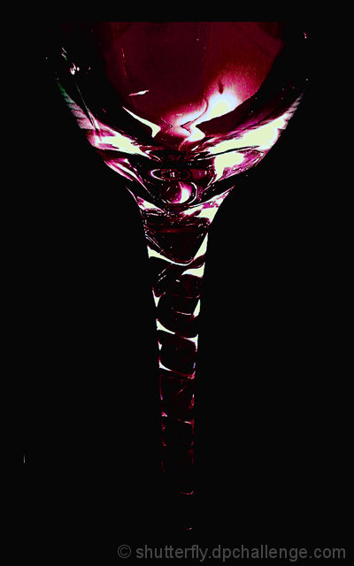
Too dark? hehehe, just kidding... I guess you've had this comment already...
Very interesting work on the lighting. The white spot close to the left bottom corner is VERY distracting, you should have get rid of it.
Good work anyway.
The image as a whole seems dark and there are some areas where the lighting is too harsh. It looks like with more balanced lighting the pattern in the stem could have been brought out.






 Add photograph to your favorites
 Add photographer to your favorites


 Photographer found comment helpful.


