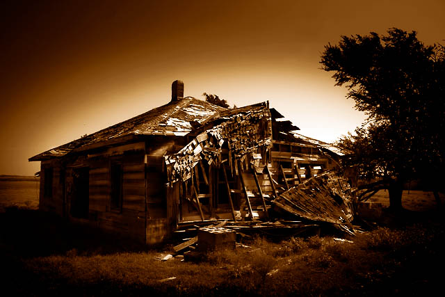
I am somewhat torn with this image. It´s a little dark for my taste and the gradient sky or wignetting is a bit too strong for my taste. On the other hand the sepia toning works very well and this photo really stands out from most others in the challenge and you have excellent textur ein the building and this is very interesting.
I must say If I could give you a score in the twenties I would, not only because this is a great picture, but because that how many syllables your title has.
Interesting treatment. A bit dark on the side, and the background light doesn't seem to match with the hilighting on the front of the building. Nice effect though.
Ridiculously long title, but a great image nonetheless. And no points off for the title. :-) I really like the glow, I do wish the house wasn't centered (really my only other complaint). Very nice job.






 Add photograph to your favorites
 Add photographer to your favorites


 Photographer found comment helpful.


