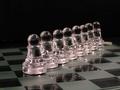
I feel that the lighting looks a little off, and the way that the glass suddenly stops at the end is bothersome. Good use with the blue background, but there is too much empty space at the top... also keep in mind the rule of thirds, as this is extremely centered, and not very interesting. Not much there to make this photo worthwhile.
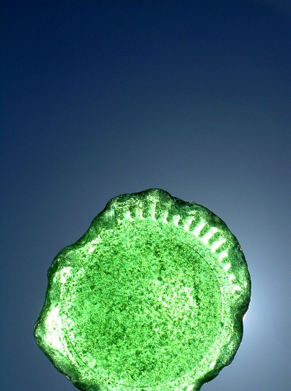
Great usage of empty space and very appealing colors. I find the abrupt crop at the bottom disturbing though. Somehow, I'd like to see either the whole bottom of the botle or a much stronger crop so only half of the bottom would be visible.
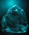
Fits the theme well, but it feels overprocessed to me, with those neon grainy bits glowing out of the shot. If it were a little more subtle/realistic, I'd have graded it higher. This is a personal taste choice. :->
your backlight is leaking out a bit, and I think I'd have chosen a different background colour (something complementary,rather than contrast-y) but I like it. 7-up you think?





 Add photograph to your favorites
 Add photographer to your favorites


 Photographer found comment helpful.


