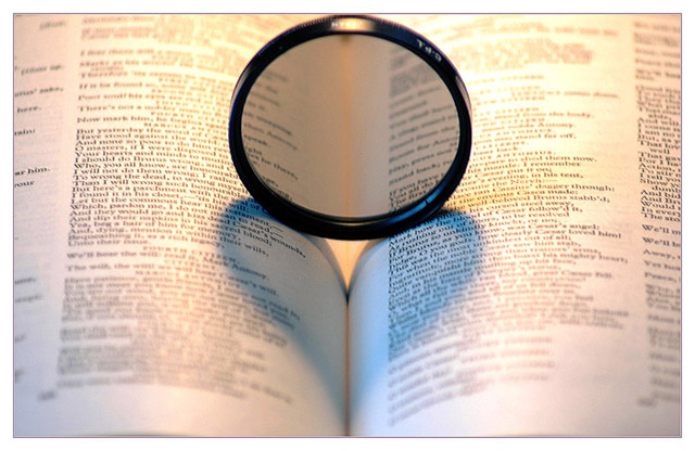
this has been done too many times and i dont even think its done that well here. focus seems off and theres not really a composition here to me. its all just smack in the middle which doesnt seem like this works for me.
I would have thought this was a very original idea, if I hadn't already seen it on this site. Try to be more originial in a staged shot like this. It just doesn't convey the same message as used in the other challenge.
This is simple and the centered circle works in this instance. I like the heart it creates on the page. Nice and uncomplicated capture. I might try to figure out a way to rid it of the yellow of the bright light at the top of the page since it's a tad harsh.
OK, this isnt very original since it was only recently done by someone in DPC. but for this photo alone, i'll have to comment that the cropping is a bit poor...the lense got cropped off at the top, and too little space at the bottom too...







 Add photograph to your favorites
 Add photographer to your favorites


 Photographer found comment helpful.


