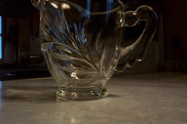
I like the lighting effects on the pitcher. I would have cropped the bit of wondow on the left though and maybe tried to frame the whole pitcher in the shot.
Mark
It likes like you were trying to pick up the blue lighting in the jug, good idea. your picture is however let down by the a lack of cropping. You really should have cropped a bit off the left so the window is out of site. If possible would also have suggested putting a black top ove the bit of light just to the left of the jug. I would also like to have seen any reflection there would have been on the rim. Prehaps by shooting this shot as a protrait rather than landscape, might have resolved some of these issues.
i wouldn't have cropped the top off of this, but I would have cropped the window and some of the cluttered background out. Using a longer lens (zoom) or a backdrop would also help with that.
This image meets the challenge, all right... but I'm afraid it's not very attractive to me. I hope that I not offend you by saying this.
I think the area of improvement mainly lies in the composition: cutting off the top of the object and the distracting blue 'streaks' (window?) on the left.
Other: the image is a bit underexposed, wich translates in loss of detail in the object.
If I may give a tip: try to take more time for the composition of the image. Try to shoot the object from different angles. Use different materials as a background...
Hope this was helpful. Regards, Marco
I don't really understand the purpose behind the cropping here. I think if it were symmetrical in both directions, or asymmetrical in both, it would work. The way it's set up here, it looks accidental to me.





 Add photograph to your favorites
 Add photographer to your favorites


