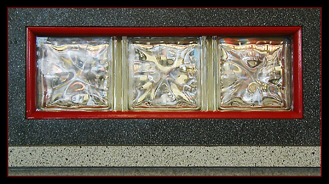
Interesting shot. Very "fine art". I'm not sure that I like the lighter line running across the bottom... Actually, upon closer inspection, I do like the lighter line, it's the line below it of the darker color that I don't care for. I think with the lighter color at the bottom, it's still simple enough that the centering works well and you're effective in the minimalist feel that this has, but the little bit of dark makes it busier, and it doesn't work as well. Of course, that's just me... Maybe I'm reading too much into it and I should just go get another cup of coffee. :) 8








 Add photograph to your favorites
 Add photographer to your favorites


 Photographer found comment helpful.


