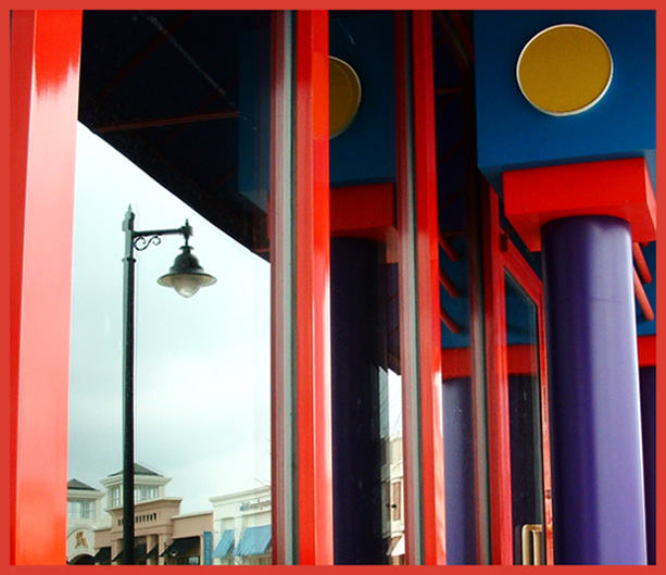
great colour. the perspective is a little hard with a wider lens...the window frame stays vertical, so the pillar distorts a little. your border actually accentuates this. I\'m not a big fan of borders anyway, but if you are going to use one, I\'d have gone with a contrast colour rather than trying to match the paint...it kind of highlightes the perspective thing mentioned above.
There was nothing blatantly 'wrong' with this photo, and if the theme were reflections I'd probably have given it an 8 or so, but as it is, other works got deeper into the 'glassness' of the glass in their photos, so I had to leave room for a representative spread in my ratings.





 Add photograph to your favorites
 Add photographer to your favorites


 Photographer found comment helpful.


